Kommunity Fitness
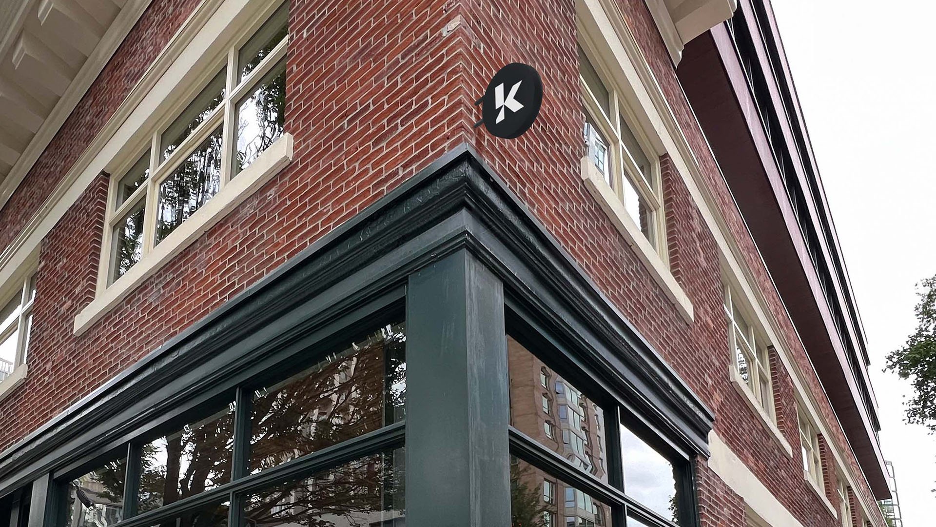
BRAND VISUAL LANGUAGE - SOCIAL DESIGN - PRINT DESIGN - DIGITAL AD DESIGN - MERCH DESIGN - SCREEN DESIGN - INTERIOR SIGNAGE - EXTERIOR SIGNAGE - PHOTOSHOOTS - PRODUCTION AND ART DIRECTION ASSISTANCE
CREATED AT THE SOCIAL CIRCLE
CREATIVE DIRECTOR — Alexis Young MARKETING DIRECTOR — Danielle McNiell
PRODUCER — Brandon William Fletcher
IN COLLABORATION w/ Mothership Marketing
Recipient of Cascadia Design Award
2nd Place Best Brand
THE CONCEPT
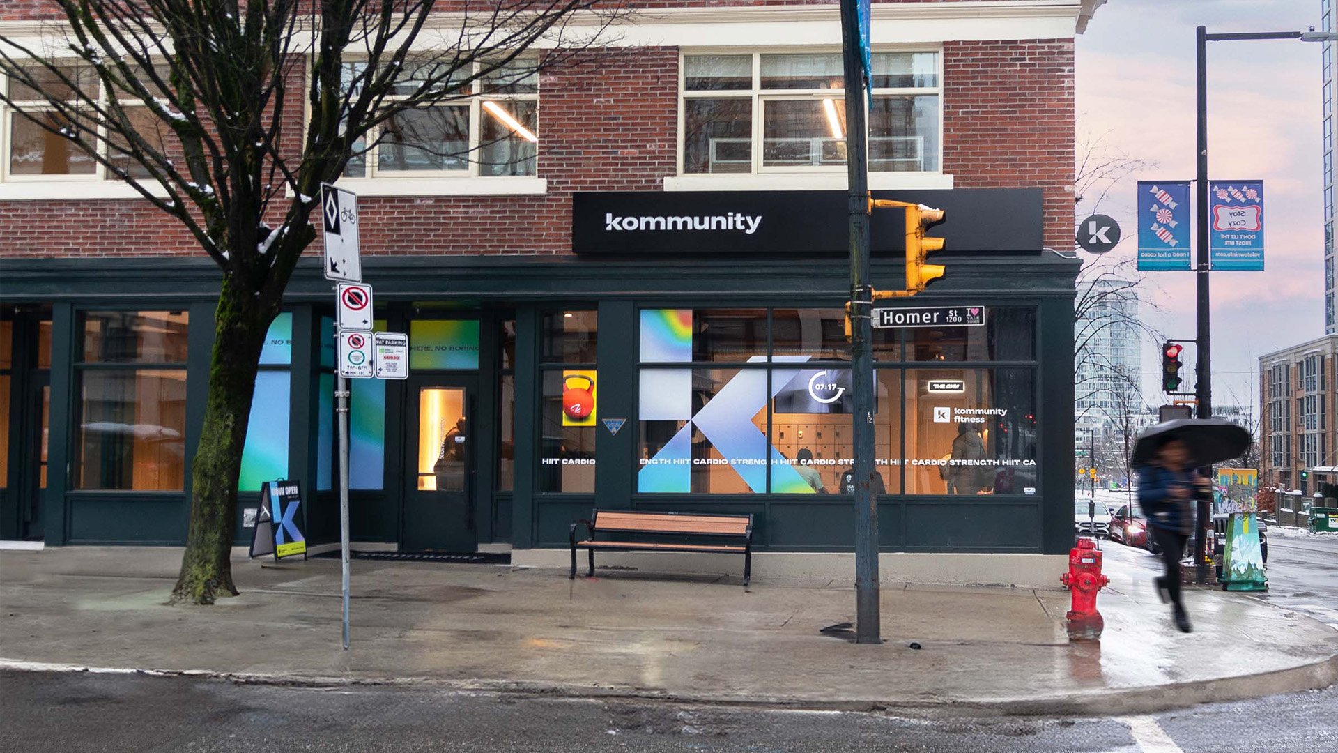
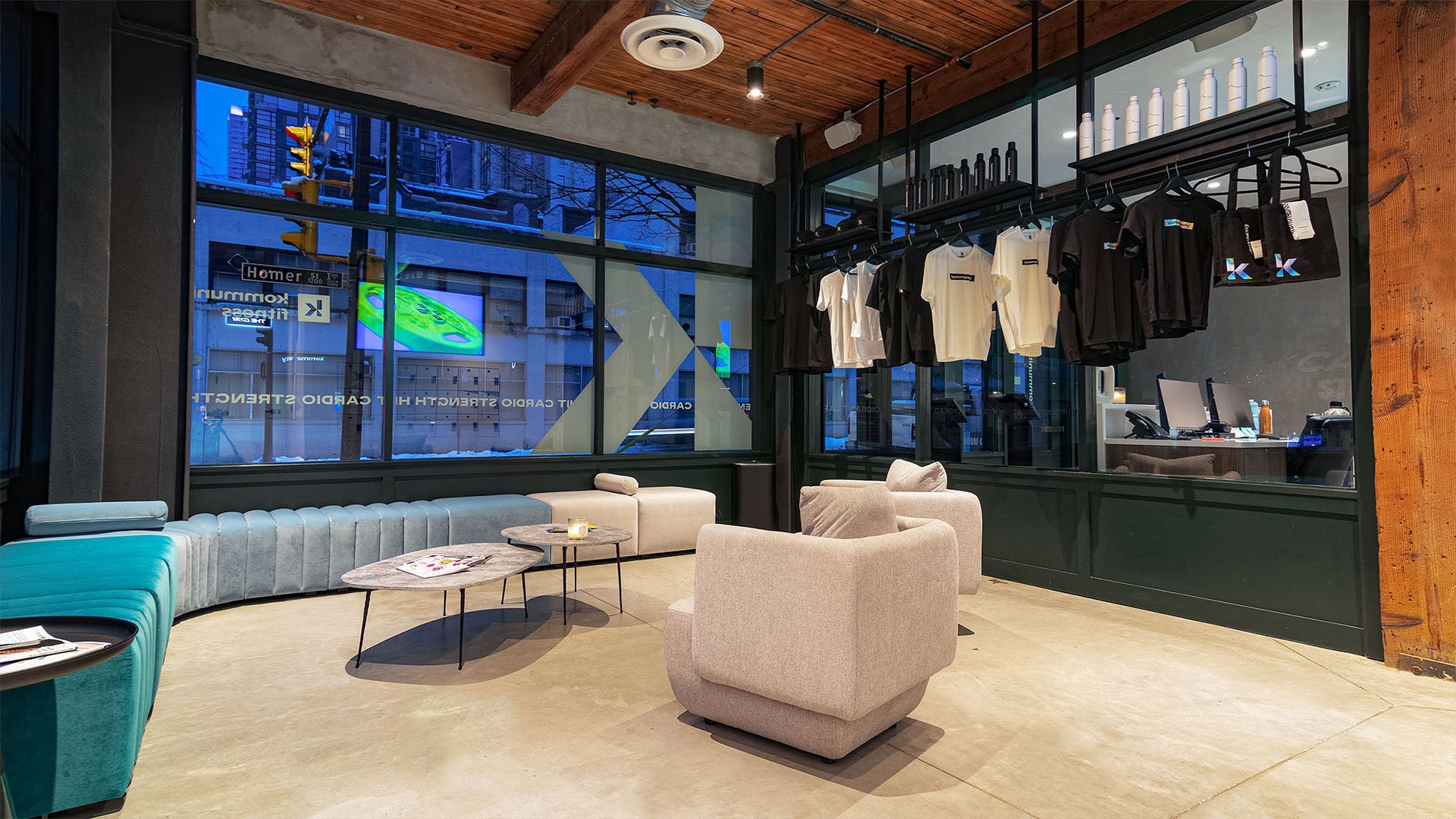
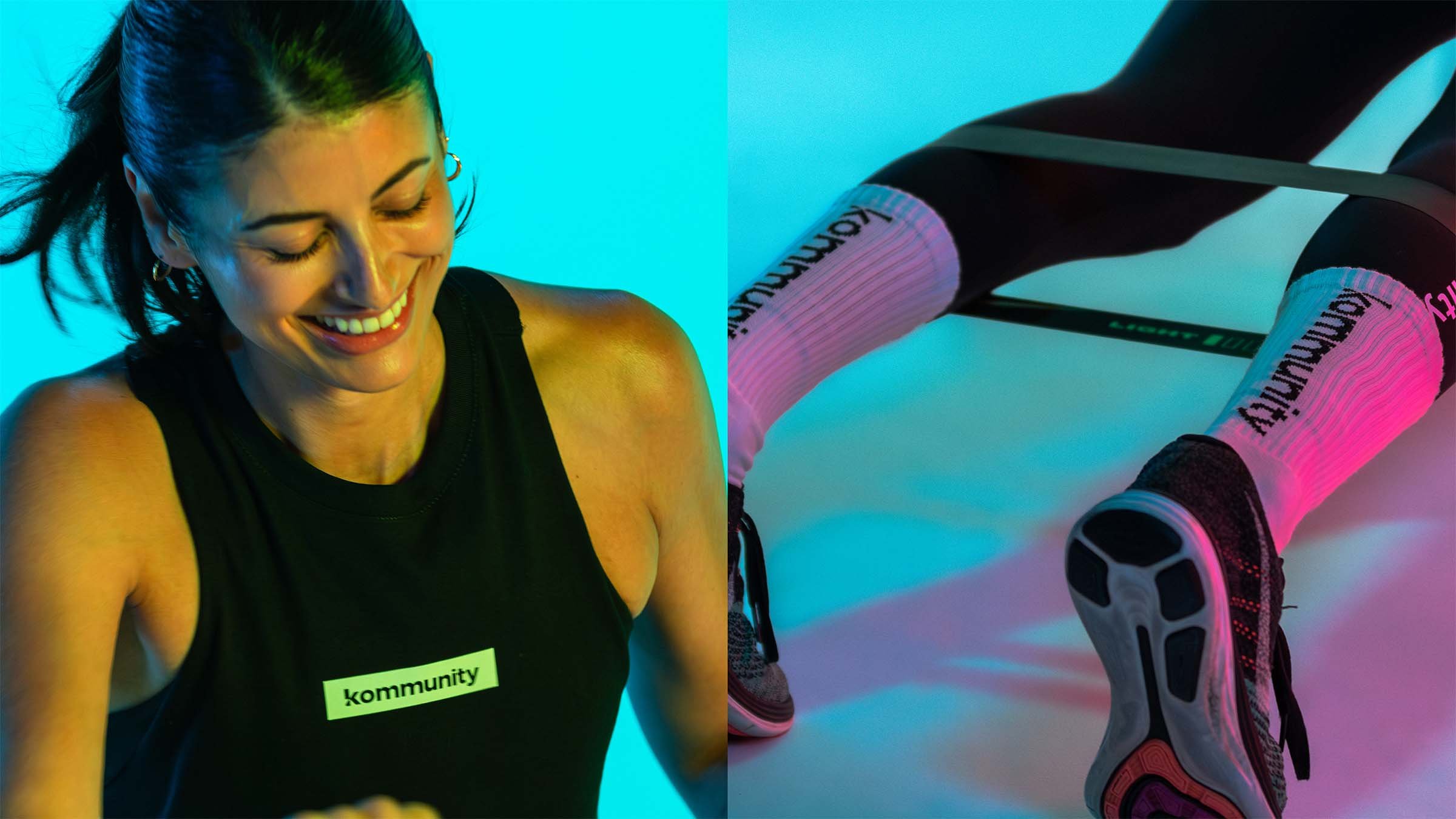
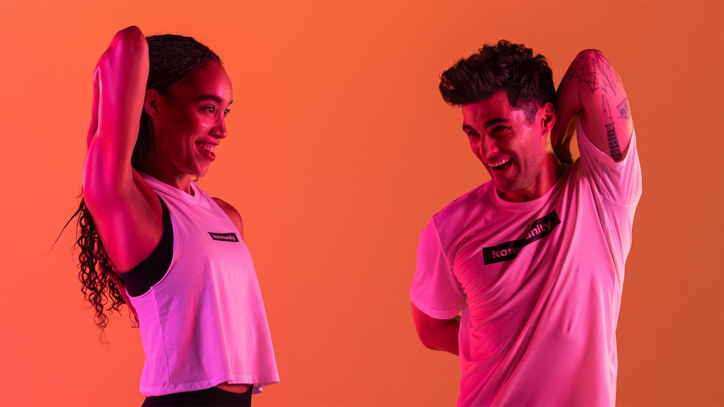
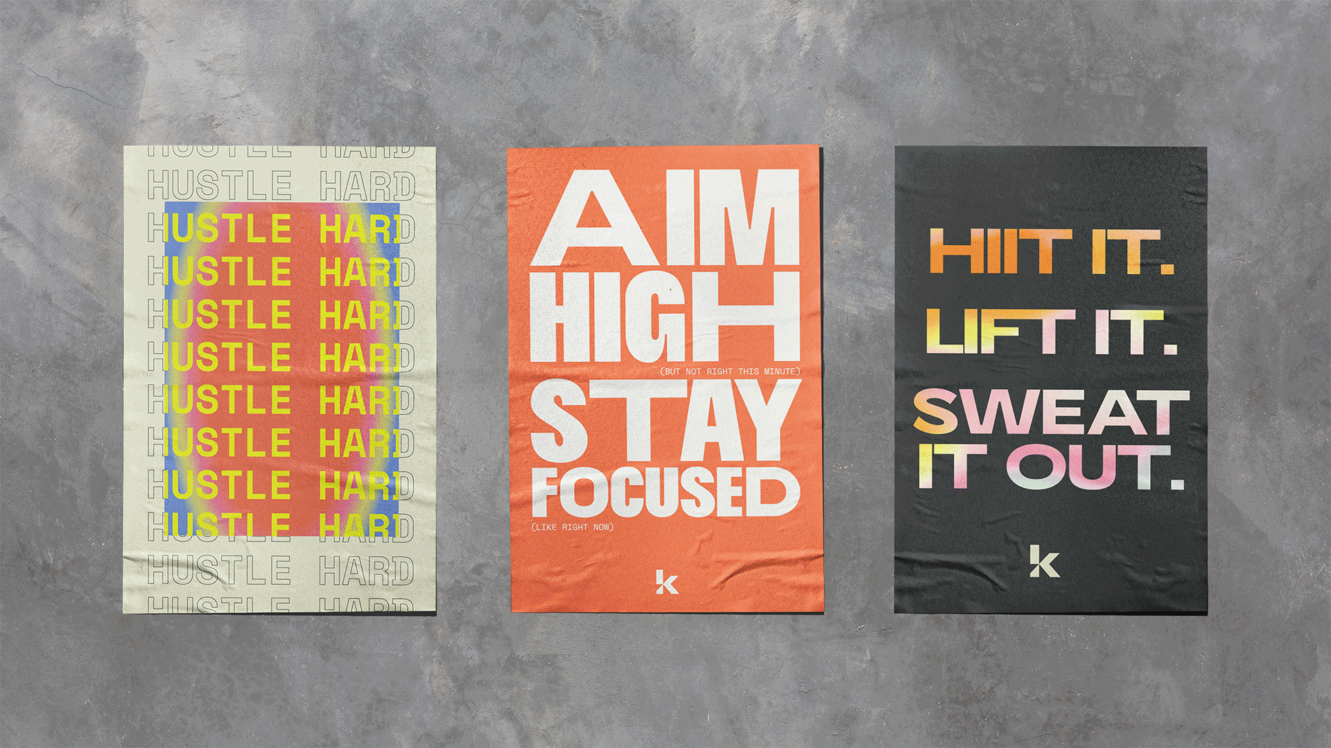
Kommunity Fitness is a premium class-based gym that offers high energy full body workouts. The gym separates itself from its competitors by blending a mix of on screen instruction and high energy instructors assisting each member with form, motivation, and machinery. A year in, the work we created won second place Best Brand at the Cascadia Design Awards in Portland.
With a slogan of “No boring here,” the clients goals were to make something personal, lively, colorful, and unique to set themselves apart from the ultra-minimal trends we were seeing in the current class focused gym market.
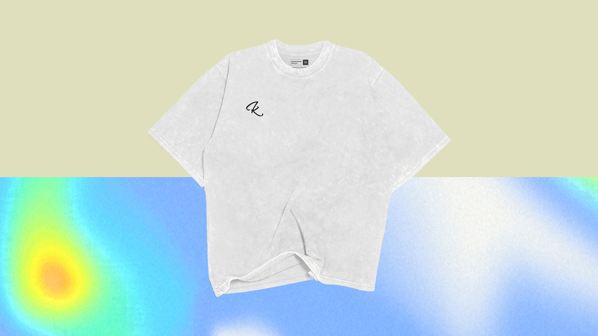
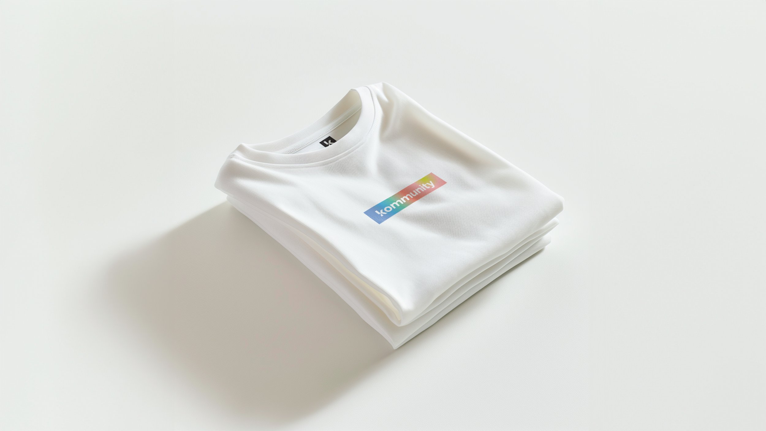
Our concept was the leading informer of the visual language. We focused on the inherent energy we create and gain through moving our bodies both together in a class environment and as individuals. Heat, sweat, energy, action, potential, motivation, these were our driving concepts as we created the brand. This took form in two main components: a living thermal gradient device, and a variable typeface that could contract and expand in real time reminiscent of muscles and energy.